Our Favorite (Websafe) Font Pairings
Updated: April 4, 2025. Please note this blog post was published while I was at Corporate Three Design and reposted here upon their closure.
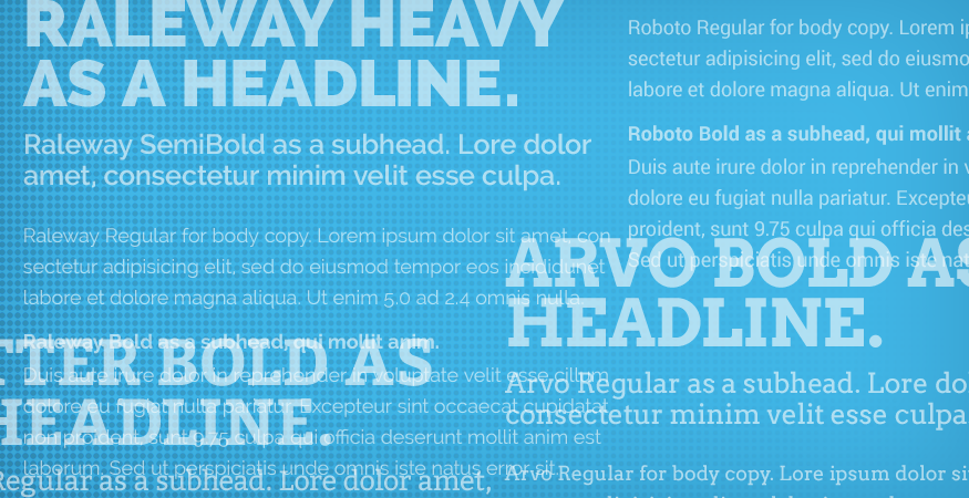
Looking for a bit of typographical inspiration for your next web project?
Below is a rundown of some of our favorite websafe fonts.
Raleway
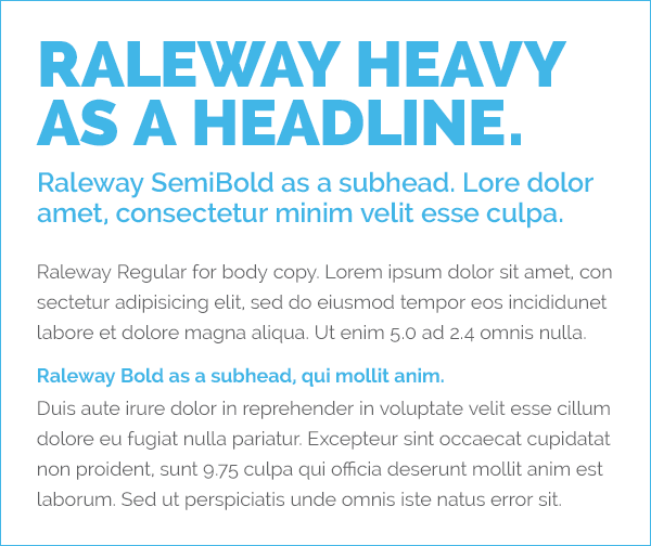
A nice solid sans serif for the web. If you’re a fan of Gotham, you’ll like this one. Weights range from Extra Light to Heavy. A couple small drawbacks, in my opinion, are the “wonky” Ws and the baseline shifts with the numbers. I’ve sometimes switched my numbers to Verdana, but that gets annoying.
Bitter & Helvetica
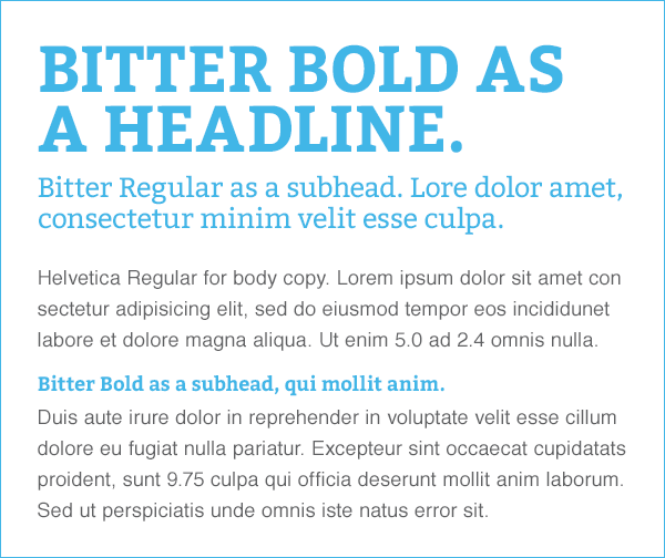
A fun serif for headlines and subheads that adds a little life to the layout. Paired with a classic sans that’s easy to read and gets the job done.
Roboto
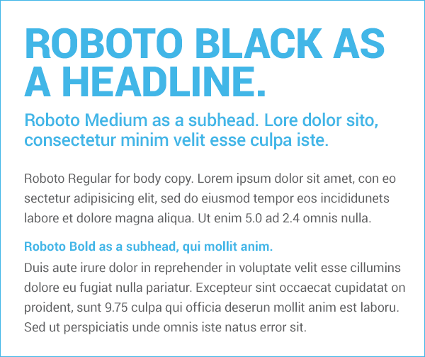
Another nice sans serif with a good range of weights. If you’re in the mood for something Helvetica-ish, but a little different, here you go. (As a side note, it was developed by Google for their Material Design branding.)
Arvo
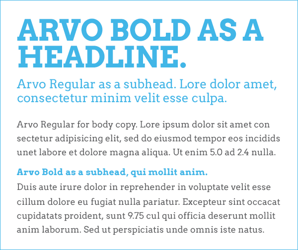
Arvo is a slab serif that offers a nice little change of pace.