The Art of Kerning
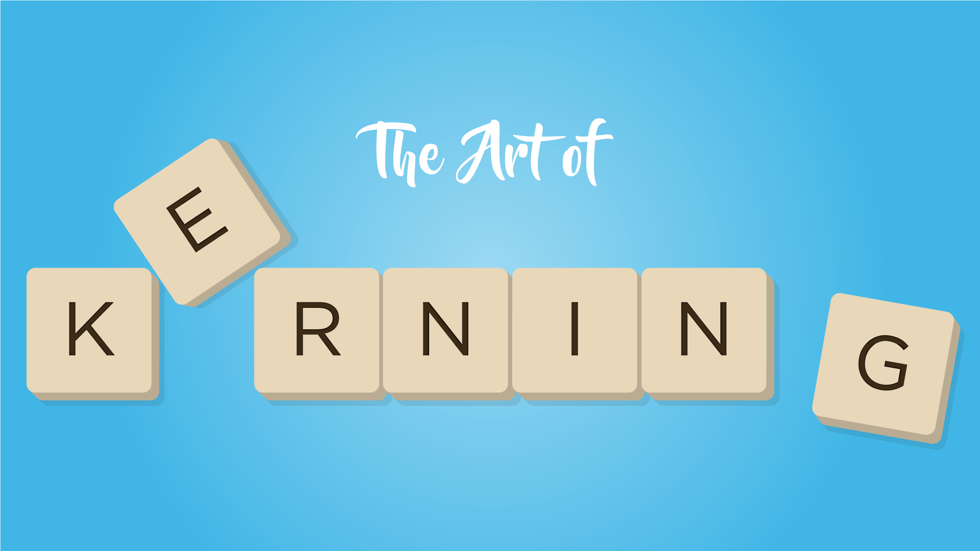
Kerning is the often neglected art form of adjusting the space between letters of a word to increase the content’s readability. Learn more about how it came to be, and how you can learn to master kerning.

Kerning is the often neglected art form of adjusting the space between letters of a word to increase the content’s readability. Learn more about how it came to be, and how you can learn to master kerning.
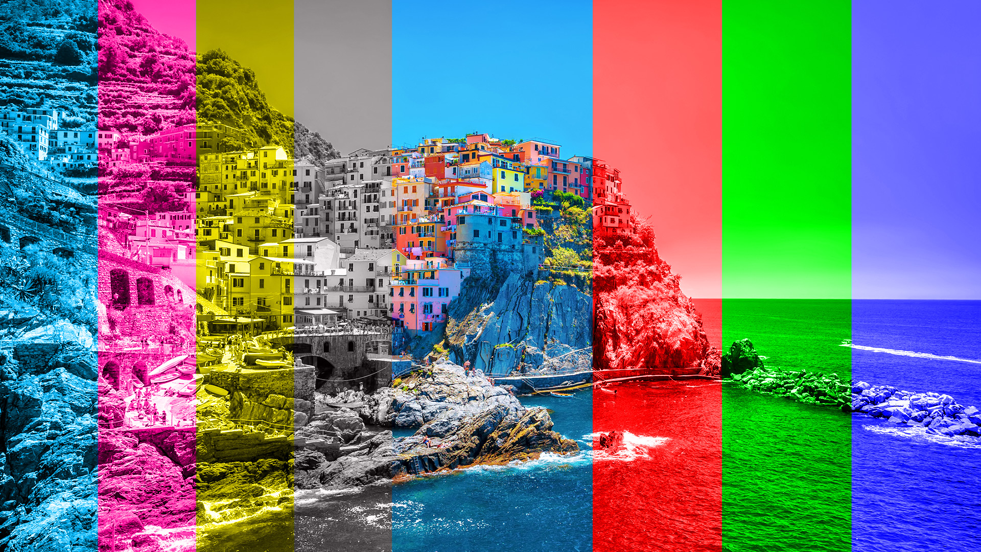
Color can affect your mood, what you think of a new brand, and even influence your buying choices. Getting the color right in your designs is crucial if you want to convey the right message. As a designer, it is essential to know when to use RGB or CMYK. You want to make sure your document color mode is set correctly depending on your project or you could spend a lot of time fixing improper color values.
Free the SVG: Vectors For Everybody Updated: April 4, 2025. Please note this blog post was published while I was at Corporate Three Design and reposted here upon their closure. Bringing vector graphics files into the mainstream What are SVGs? Scalable Vector Graphic or SVGs are image files that are viewable in a web browser. … Read more
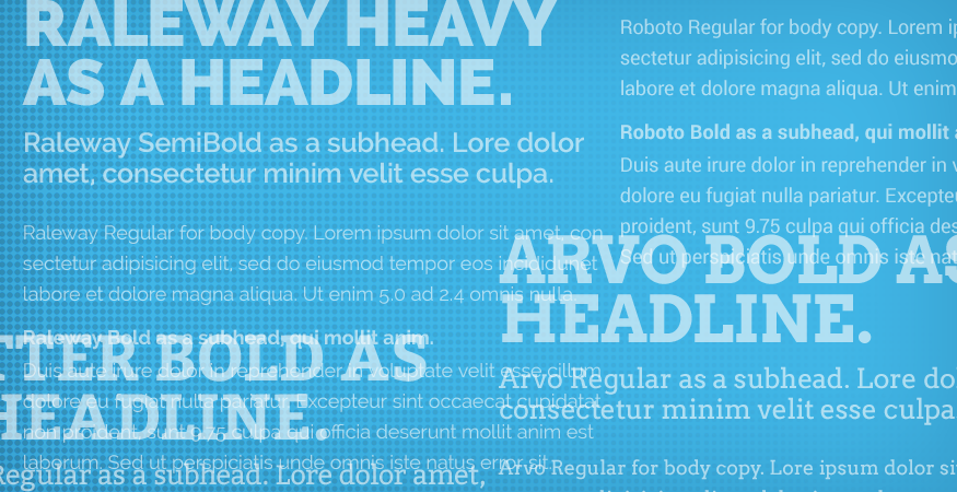
Our Favorite (Websafe) Font Pairings Updated: April 4, 2025. Please note this blog post was published while I was at Corporate Three Design and reposted here upon their closure. Looking for a bit of typographical inspiration for your next web project? Below is a rundown of some of our favorite websafe fonts. Raleway A nice … Read more

How To: Pair Typefaces Like a Pro Updated: April 4, 2025. Please note this blog post was published while I was at Corporate Three Design and reposted here upon their closure. Pairing Typefaces is fun, but also challenging. Selecting fonts that look good is easy. Selecting two fonts that look good and work well together … Read more
I work with startups, small businesses, and established brands across the U.S., providing hands-on website help, WordPress development, and local SEO services from my Omaha base. Whether you need to fix a slow or unreliable website, improve local search visibility, or build a site that supports long-term growth, I focus on practical solutions that make a real impact.
Contact Me
Shawn Hartley
Digital Marketing
Based in Omaha, NE.
[email protected]
© 2026 Shawn Hartley Digital Marketing • Privacy Policy • Terms & Conditions • Sitemap